reporting concerns on data leakage
Today, the Journal of Imaging Informatics in Medicine (formerly the Journal of Digital Imaging) published my Letter to the Editor (preprint) in which I raise concerns about data leakage in this paper
how it all started
In the summer of 2023, I collaborated with several others on a review

It’s not unreasonable to expect that such correlations may exist, even though it may be tricky for a human to spot the relevant features. Therefore, people have been trying to throw machine learning methods at this problem: given a set of pre-treatment MRI scans of patients for whom treatment outcome is known, one can attempt to train a model to classify the patients as either responders or non-responders to the chosen treatment. If the resulting model attains good classification performance on MRI scans of patients not included in the training set, we have some evidence that the model has indeed learned to recognize some of the salient features that are predictive of treatment response.
However, breast cancer is a complex disease and the effectiveness of a specific treatment strategy depends on a large array of factors. It would therefore be highly surprising if a single pre-treatment MRI scan would provide sufficient information for reliably predicting pathologic complete response. And indeed, most studies find that imaging features only correlate very weakly — if at all — with treatment response. For example, Joo et al.
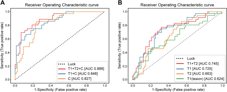
These diagrams show the receiver-operating characteristic (ROC) curve of the evaluation of their model on validation data (n=107 patients) that was unseen during training (on n=429 patients). Clinical variables were included for the leftmost diagram, whereas the rightmost diagram os for imaging data alone (T1, T2 refer to different types of image weighting in the MRI acquisition protocol). The ROC curve shows how the true positive rate and false positive rate vary as one changes the operating point of the classifier: the model itself outputs a “probability” that a patient will respond to treatment, and the operating point is the threshold at which we binarize the prediction. A low threshold eagerly classifies patients as responders, with a higher likelihood of including false positives. Raising the threshold will lower the chance of finding false positives, but some true positives will accordingly be missed.
The overall performance of such a classifier model is often reported as the Area Under the ROC curve (AUROC, or simply AUC), and the AUCs for the curves shown above can be found in the figure legend. A classifier with an AUC of 1.0 is perfect, whereas a completely random classifier has an expected AUC of 0.5, corresponding to the dotted diagonal.
Therefore, I was quite surprised when another study
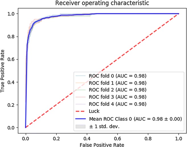
The blue graph is the ROC curve after averaging over a five-fold crossvalidation procedure. Apparently, their model attains AUCs of 0.98 on five different random 80/20 train/validation splits of their data. This would be a spectacular result, implying that their model — trained on just 113 patients — is capable of predicting treatment response with near-perfect accuracy from pre-treatment MRI scans alone.
However, all this seemed way too good to be true, and I decided to take a closer look to see what could be going on under the hood.
splitting data
The MRI scans used for this study are 3D volumes. There are multiple ways in which such scans can be fed to a CNN. A straightforward choice is to use a network with 3D convolutional filters that takes 3D volumes as input. Another option is to view a 3D scan as a collection of 2D slices, and to feed these slices to a 2D CNN. This second approach typically requires much less GPU memory and training time, and is therefore the method of choice if resources are limited. Since the paper under consideration was published in 2018, it is not surprising that they indeed make use of the 2D approach, as explained in their Methods section. The authors furthermore mention that they restrict attention to slices containing a certain minimum amount of visible tumor tissue, after which they are left with a total of 3107 two-dimensional slices of 141 patients, corresponding to 22 slices per patient on average. The slices are then cropped to 64x64 pixels centered around the tumor.

Each patient is labeled as having undergone either no response, partial response, or full response to neoadjuvant chemotherapy. All slices of a given patient are assigned the same three-way response label. The CNN is then trained to predict this response label based on a 2D MRI slice like the one shown above. As always, a test set is held back during training to validate the model’s performance after training has completed. However, finding good performance on such a single (random) choice of held-back data may simply be due to luck. The authors describe using five-fold crossvalidation to mitigate this issue, but it seems they actually employ a mix of nested and non-nested crossvalidation where only the inner loop is performed. In the end, five different models are evaluated on a single held-out test set consisting of 20% of the available MRI slices. The five ROC curves in the figure shown above report how well the model performed at discriminating one of the outcome labels from the other two.
Even though it’s generally better to validate models on several test sets in a proper crossvalidation procedure, it’s quite unlikely that the use of a single evaluation set can explain the AUC of 0.98 as a fluke. The 0.98 appears for all five models, and these were trained on (partially) different datasets. Furthermore, 20% of 3107 is still 621 slices, so the odds of getting an AUC of 0.98 by pure luck are not great.
That said, I do suspect that the explanation can be found in the way this test set was constructed.
The correct approach in this scenario would be to randomly assign 80% (n=113) of the patients to the train set and 20% (n=28) of the patients to the test set. The actual data points in the train set would then be all MRI slices belonging to those 113 “training patients”. All slices belonging to the 28 “testing patients” should be held back for evaluation after training has completed.
However, my guess is that the authors accidentally split on the slice level, rather than on the patient level.
Suppose one simply shuffles all these 3107 slices and subsequently assigns the first 80% to a train set and the remaining 20% to a test set. Considering that there are on average 22 slices per patient, it is then extremely likely that different MRI slices of the same patient end up in both the train and test set. This would imply the setup is suffering from data leakage: even though there is technically no overlap between the train and test data, one should take into account that nearby slices of the same patient can look highly similar. As mentioned in the MRI Methods section of the paper, the slice thickness of the scans was 2-3mm, so that neighboring slices show nearly the same parts of the patient’s anatomy. To see how similar such neighboring slices can be, consider the following sample taken from the public Duke Breast MRI dataset:

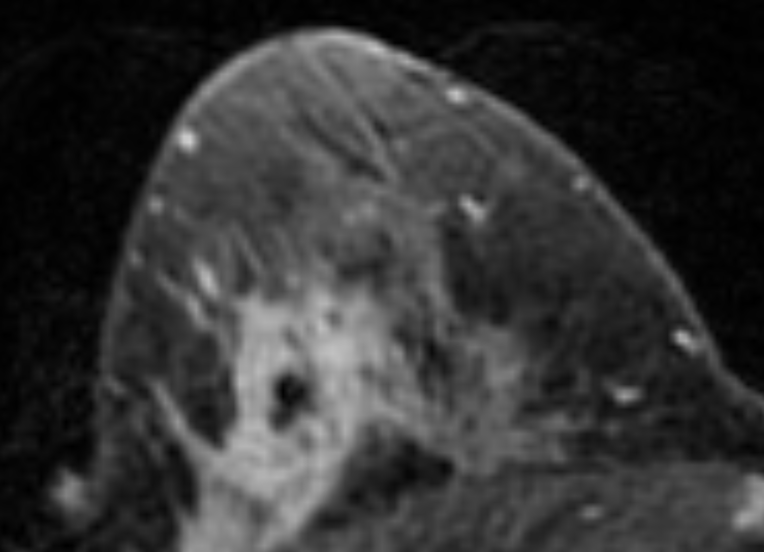
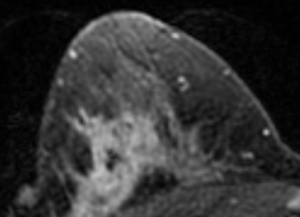
It’s easy to imagine what could happen in this case: instead of discovering useful imaging features that correlate with treatment response, the model can simply find a shortcut by “memorizing” what a patient’s anatomy approximately looks like, along with that patient’s response label. When a similar MRI slice is encountered in the “held-back” test set, the model can spit out the response label of the corresponding patient, without actually having learned any generalizable features. Neural networks are notoriously great at memorizing their training data, so finding this shortcut would be a piece of cake for the CNN they used.
Note that there is no hard evidence that this “leaky splitting” is indeed what occurred. However, the methods section is vague on the details of the split:
The data was divided into 80% validation and 20% test. The validation test set was then divided into fivefold, and fivefold cross-validation was performed. Training from scratch without pretrained weights was done over 100 epochs using adam optimizer with nesterov momentum at an initial learning rate of 0.002. Each of the five models was tested against the 20% hold out data to obtain sensitivity, specificity, and accuracy. Receiver operator curves were also calculated for each of the five models.
In any case, there is no mention of a patient-level split, so we should at least consider the accidental “leaky split” as a potential explanation of the absurdly high AUC values.
following up
Now, there’s no use following up on everything that’s (potentially) wrong on the internet. However, as of 30 April 2024, this paper has been cited 125 times (according to Google Scholar), making it something of a standard reference in the field. If these spectacular results could indeed be attributed to data leakage, they could therefore set an unrealistic benchmark for follow-up studies. Researchers might be misled into thinking that such performance levels are in principle attainable for similar prediction tasks, or form the wrong expectations for integrating models like these into a clinical decision-making workflow. I discussed some of these considerations with a few colleagues (most extensively with Eric Marcus), and all agreed that this issue did warrant some kind of follow-up.
Since the paper itself did not provide sufficient detail to resolve the matter, I first posted a comment on PubPeer back in September, 2023. The website indicated that the first author’s email address is known, so they should have received a notification about my comment. However, no reply was posted after several weeks of waiting.
The first author is also listed as corresponding author, so in late November I sent him an email to ask for the details of their data splitting procedure, and I explained why I was concerned that something may have gone wrong there. Unfortunately, I did not receive a reply in the two weeks that followed. I then sent a follow-up email, asking whether he could get back to me on this. I also indicated that I was considering to reach out to the journal about the matter:
I would like to once more draw your attention to this message. I understand you are busy and you may miss some emails every now and again, but I think this is an important issue and I would very much like to verify whether I can attain similar performance — if it can be reproduced, it would serve as a great benchmark. If you might miss this message again, I will contact the Journal of Digital Imaging later this week to ask whether they can help me get in touch with you or your team, or to provide the raw data so that I can run my own experiments.
However, this again did not result in a reply. On December 11, 2023, I therefore emailed
making the case
Since I hadn’t ever written an editorial letter before, I asked around for some advice. One of the first things my PI (prof. Jan-Jakob Sonke) advised me to do was to set up a similar experiment to try and reproduce the paper’s results for a similar prediction problem. The public Duke Breast MRI dataset
Subsequently, I made two random 80/20 train/test splits of the slices: one “proper” split on the patient level and one “leaky” split on the slice level. I then trained a convolutional neural network (more specifically, a ResNet18) on each of the train splits, and subsequently evaluated the models on the corresponding test split. This resulted in the following ROC curves:
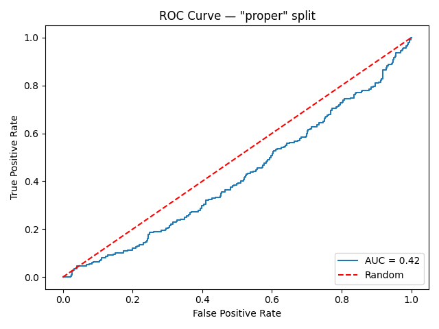

That’s quite a big difference. It may seem surprising that the “properly” trained/evaluated model attains an AUC below 0.5 — worse than what is expected from random guessing. However, the 0.5 is just an expectation value, and the AUC of any given random classifier is likely to be found somewhere close to this number. Therefore, we can interpret the leftmost graph as evidence that the model couldn’t find any generalizable imaging features relevant for predicting treatment response during training. On the other hand, the model trained on the “leaky” set of slices attains a near-perfect performance, misclassifying only a handful of images.
Although this experiment still does not conclusively prove that the slice-level split indeed happened in the paper, it does demonstrate that such high AUC values are indeed possible in this scenario — even when the underlying intended prediction task is extremely difficult, if not impossible.
wrapping up
I now felt the case was strong enough to actually draft the letter to the editor. As a final touch, my other PI (Jonas Teuwen) suggested to ask some more senior people in the field to co-sign the letter. I approached several colleagues and collaborators, all of whom agreed that this matter deserved further attention, and all agreed to co-sign. I officially submitted the letter on April 10, 2024 — a little over half a year after I first posted the comment on PubPeer. It was quickly accepted and has now appeared online after a brief production process. To my knowledge, the authors have still not responded as of today.
A minor disappointment was that publishing the letter with full Open Access would set me back $4390, which seemed somewhat excessive. My institution does have an Open Access agreement in place with SpringerNature, but apparently this does not extend to editorial letters. I therefore had to opt for the subscription-only publishing route. The upside is that this motivated me to write this post, since I felt that having the full story behind a paywall would partially defeat its purpose.
I do feel that the story shouldn’t end with the publication of this letter. After all, my concern was that the original work would set an unreasonable benchmark for follow-up literature, and that won’t change in the current situation. Primarily, I hope that the authors will still take up the invitation to respond and clarify their methods. I don’t mind who turns out to be correct, but open discourse about these issues is the only way for science to proceed.